A Tropical Abode
As you step in and look down the hallway of the new home, you'd notice the length of the dining and living rooms, while feasting on the interesting breaks along the way, from the large wood-framed sliding glass kitchen door, to the wonderfully placed punching board, to the unique there-but-not-there partition separating the dining and living rooms, and to the wooden beams on the living room ceiling.
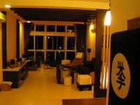
Instantly, you say,"So yours is the Balinese theme!"
"Correction, it's a tropical theme. There is a difference." The owner was quick to point out.
Same difference? That was the spontaneous mental argument. But as you ponder over the 2 terms, you realise the similarities stop at the dark wood furnishings and the earth-toned wall colours. To describe the place as Balinese would be unfair, hinting at the revisiting of a near passe trend. However, a tropical theme would put place a holistic and timeless feel to the HDB executive apartment, proud of Singapore's tropical climate, yet claiming its own unique identity.
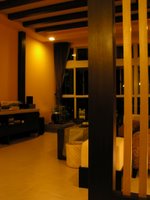
As you venture further into the living room, you notice that most of the furniture cannot be found in furniture shops. The owner explains that they were painstakingly designed and fabricated to suit the tropical theme, and are fully functional for everyday use and maintenance.
"We wanted something different from what you can find in the stores, yet we did not want a house that looks good in magazines but is extremely difficult to maintain," so the owner explains.
Unlike older flats of yore where you can see all the bedrooms from the living room, newer HDB apartments like this offer a much-needed corridor to all the rooms, so there is a good degree of privacy by "hiding" the rooms from public view.
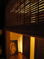
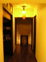
The shortened corridor itself is an inviting walkway that hints conspicuously of a warm abode behind each door. It is lined with timber strip flooring, ending with a false partition that is covered with a bamboo-textured wallpaper. On the floor, a portrait of Buddha's profile has been carefully positioned against the wall to exude a careless, laidback look to the corridor. The other thing that stands out is the intriguing lamp hanging on the corridor ceiling. The owner received this ornamental fishing basket of Vietnamese origin from his brother and transformed it into a lamp which throws an intricate light pattern on the ceiling.
The study is a comely space for the owners to fill out serious paper work, and to leisurely surf the internet too. The first thing you notice is the big wall clock that, well, uses the wall as the backdrop. The large clock, which by itself consists only of a large hour hand and a larger minute hand attached to a small cylindrical disc that hides the mechanisms, was carefully packed and hand carried by the owner's stewardess wife from Amsterdam. It is then that you appreciate the little knick knacks and oil paintings found around the house, all carefully picked from over the world to bring an eclectic mix to the tropical home.
As one steps into the master bedroom, you are awe-struck by the resort-like layout. The cozy sleeping area is adjoined by a walk-in wardrobe with en-suite bath, a nice little TV corner, and even a recessed make-up area ingeniously created by shortening and partitioning up an otherwise unnecessary length of corridor. You soon realise that 2 rooms have been combined to create this princely master bedroom.
A king-size bed sits nicely behind a wooden partition similar to that of the living room and has the same bamboo-textured wallpaper earlier seen in the corridor as a backdrop. It is interesting to see how the designer/owner overcame an inauspicious belief that a bed should not be placed directly under a concrete beam. Instead of wasting precious space by building a false wall to cover up the beam, a wooden light box has been specially crafted and installed under the beam, creating a warm, classy feel to the sleeping area.
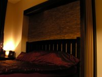
The master and guest bathrooms that come with very charming double-leaf wooden doors deserve special mention here. The premium HDB apartment provided for fully fitted bathrooms. However, the colour scheme and materials used were less than desirable to the owners.
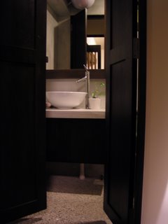
"It was not so much that cheap materials were used, but more the colours and choice of materials used were not to our taste," says the owner. "The original orange and green coloured "toilets" were purely functional, where you would finish up your business and get out. They looked very tired and out of place from our ideal look. We revamped both the toilets and now, I proudly call them "bathrooms", where you can really enjoy a relaxing shower or soak in the bathtub after a tiring day."
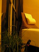
It is very clear that the owners of this resort-like home suscribe to the idea that a home is purely for relaxing. One would notice that almost the entire house is devoid of white-colour lights. Majority of the lights come in "warm white", which the owner very much insisted. The more serious nodes in the home such as the study and reading bamboo chaise are provided with reading lamps. The only 2 areas that were allowed pure white-colour lights are the kitchen and the wife's make-up area, to ensure that food is properly cooked and make-up is correctly applied!
The final stop in this 1400sf abode is the kitchen. The spanking new kitchen screams intelligent style all over. A towering wood-framed glass door stands by for some serious cooking while the sleek TEKA kitchen appliances are all ready to help the owners whip up their favourite meals. The tower cabinet holding the microwave and convention ovens is strategically placed for easy reach and also to "hide" the laundry area behind. Clever.
At the end of the tour, you feel almost reluctant to leave this resort of a home, not unlike the dreadful feeling you harbour inside when it's your last day of holiday in Bali. Not surprisingly, this tropical paradise is also the owners' favourite destination. With their new place, they can look forward to coming home to a tropical paradise everyday.
Now, to overcome the daily inclination to call-in sick and soak in the bathtub...
redcocoon

3 Comments:
Power la babe! Like Home&Decor like that!
Nice....!
Wolf WhistLe..
Post a Comment
<< Home